As a wedding and portrait photographer, I find my clients love sourcing inspiration images when planning their wedding or session. And spoiler alert: I love having a visual representation of where their mind is at and the particular components of an image they’re drawn to. Still, some people find it quite overwhelming to source inspiration, especially inspiration that accurately portrays what they’re hoping to get out of their images. If that sounds like you, you’ve come to just the right place!
First, a little back story. The year was 2014, and I was a wide-eyed college freshman with a major I knew very little about—Graphic Design. I’d been editor of my high school yearbook and found I loved the process of putting together a structured layout design, from type treatments to color palettes and everything in between. But, that was the extent of my graphic design knowledge. Needless to say, I was in for a rude awakening (no one warned me about group critiques by picky professors—an introvert’s worst nightmare). Over the next four years, I would hone my skills as a designer, mastering the principles of design and refining a very underrated skill—sourcing inspiration for each project. Indeed, there is an art to finding moving images that accurately convey the feeling you want your outcome to evoke.
Today, I’m so excited to kick off a new series here on the journal, The Mind of a Designer. This series is all about thinking with a design mind when it comes to your photos. We’re kicking things off by talking about sourcing quality inspiration—where to find it, what to look for, and how to curate your selections to create a cohesive vision. I’m sharing my very own best practices for finding the most valuable inspiration (the kind your photographer will happy squeal over).
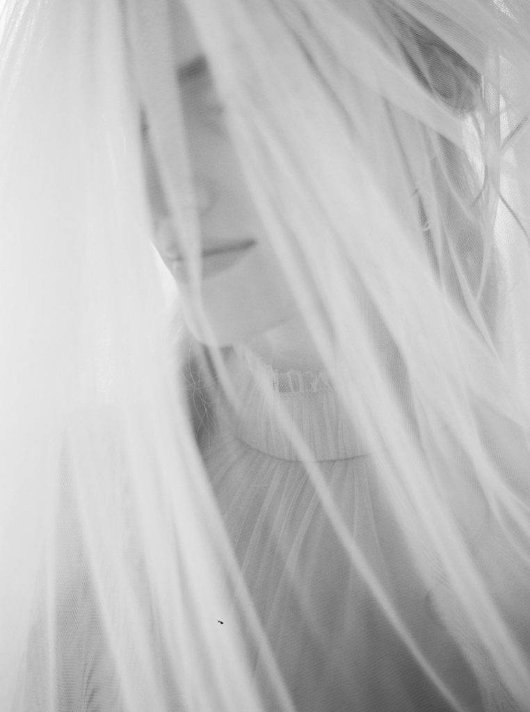
Where to Source Inspiration
The classics are classics for a reason, and Pinterest is no exception. I use Pinterest for sourcing nearly 90% of my images when creating Vision Boards for my clients and designing editorials. By searching key phrases like “organic fine art film photography“, “Parisian bridal editorial“, or “nostalgic motherhood photos“, the Pinterest algorithm curates my home feed with gorgeous images ripe for the picking. I also search phrases that are more general to find what I call “sister” inspiration (inspiration not directly related to photography) such as “minimal classic design” or “romantic landscapes“. This way, I have a wide range of images in my Pinterest feed to choose from, making sourcing inspiration much easier in the future.
Pro tip: Install the Pinterest Save Button in your Chrome browser to pin images you find anywhere on the internet. This is especially helpful when hunting for the perfect outfit to add to your Vision Board!
Do I think the glory days of Instagram are behind us? Yes, yes I do. And yet I find myself falling in love with images I come across almost daily. If you follow me on Instagram, you know I post a segment called Things I’ve Been Saving every couple of weeks where I share my best inspiration finds with my followers. During my daily Instagram musings, I save all types of images and don’t restrict myself to just saving wedding or portrait sessions. In fact, I find the best inspiration comes from following various types of artists, like ceramicists, architects, and fashion designers. Instagram even allows me to save images to a specific folder for quick access down the road. Using the Pinterest Save Button mentioned above, I can visit Instagram on my browser, navigate to my Saved folder, and pin those posts to my Vision Board. Et voilà!
BOOKS AND PRINT MATERIALS
Inspiration really is all around! Just like film, I am a firm believer that print is not dead. Call me naive, but some of my favorite inspiration comes from the pages of magazines like Vogue, Architectural Digest, and Brides. Even old book covers brim with inspiration! Collect your favorite physical inspiration, tape it on your wall or cork board, and edit anything that doesn’t fit. You can even take iPhone photos in good light of your pages to add them to add to your digital Vision Board to keep everything in one spot.
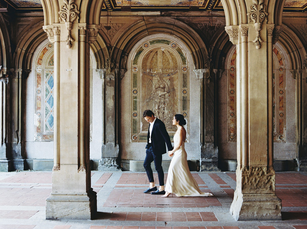
What to Look For When Sourcing Inspiration
COHESIVE COLOR STORIES
The number one mistake made when sourcing inspiration is inconsistency in the tones in a set of images. Aim to source images that are consistent in color and reflect your photographer’s work. For example, if your photographer’s style is marked by organic, neutral tones, using images that are extremely bright and vibrant is unhelpful to you and your photographer. By no means do the images you source have to be identical to the images in your photographer’s portfolio, but they should be in the same camp.
Additionally, it’s important to consider the color story of your specific session. Getting married in a garden with a moody mauve bouquet? Select images that have mossy green and muted pink tones. Having family photos taken at your favorite beach? Source inspiration with soft blue and cream tones to reflect the environment. If the goal is to create a cohesive set of images to communicate your vision, the foundational building block is color.
COMPOSITION
While composition shouldn’t be your main focus when sourcing inspiration, it is a factor to consider. Ultimately, inspiration images clearly allude to the type of composition you’re drawn to (i.e. lots of negative space, minimal backgrounds, movement, etc). Still, it’s important to remember you hired your photographer because their images and compositions resonated with you. Including different types of compositions is a welcomed practice as long as the set of images are balanced and communicate the feeling you’re after.
LIGHT
As you probably know, light is everything to a photographer, especially a film photographer like myself. The beauty of photography is that everyone sees light and translates that perspective in their images uniquely. With this in mind, it’s important to select inspiration images that use light in a way that speaks to you. Take note of light in your everyday life, and you’ll quickly realize what kind of light makes you emotional (it’s a thing, I promise). Do you drool over glowy light at sunset? Mesmerized by hazy light in the morning? Have you found yourself basking in direct light from your windowsill? In different scenarios, light behaves, well, differently. Finding what type of light speaks to you and use that information to inform the selections you make.
TEXTURE
Oh, yummy textures. This may be the most underrated component of visual inspiration of them all. Texture can communicate so much in a single frame—movement, space, direction. When thinking of which textural elements as inspiration, think of your location and fashion. Soft grass, stone facades, lush tulle folds, and decadent silk can add so much visual interest to your inspiration collection.
PATTERN
Selecting images that depict the design element of repetition or pattern may not be an obvious choice, but they provide context in a Vision Board. Of course, choose pattern inspiration that plays to your color story and the overall feel you’re going for. The pattern in these images specifically can be obvious or more abstract. You’ll come to find that a strong pattern selection can complete a set of inspiration images very nicely.
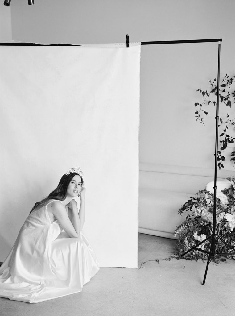
Curating Your Selections
Once you’ve carefully selected your images, it’s important to pair them down. Too many images can be overwhelming and cause confusion, even if they are cohesive. If you are curating your final Vision Board, I’d suggest selecting 5-7 final images that range in subject matter. You can always keep a more extensive board on hand via Pinterest to elaborate on your vision.
User friendly sites like Canva give non-designers an easy way to compile their inspiration effortlessly. I’ve crafted a mock template of my go-to Canva layout for my own Vision Boards, and it’s so easy to use. Just replace my images with your own, and feel free to move the images around to create a layout that works with your image orientations.
If you’re more of a visual learner like I am, take a look at two Vision Boards I’ve crafted recently for my clients and the reasoning behind the image selections.
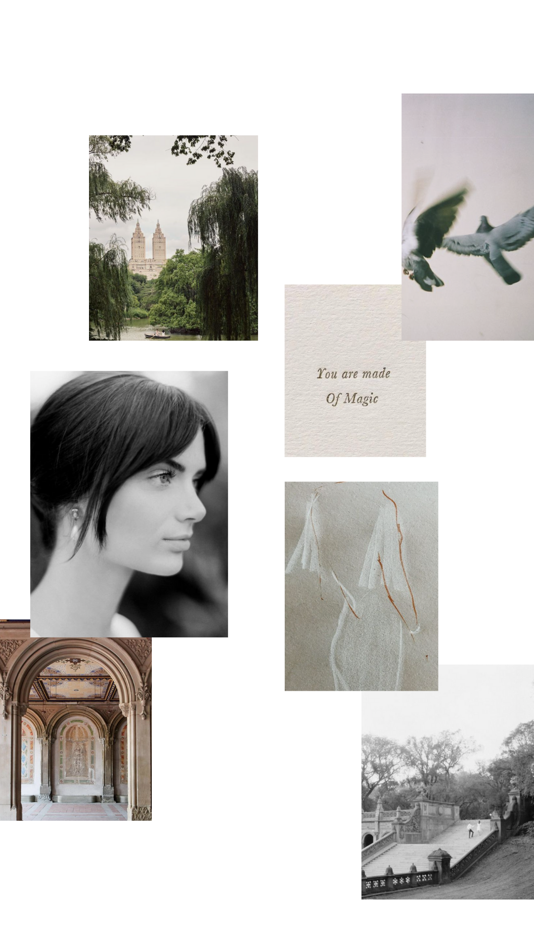
A Romantic Morning in Central Park
Goals: Highlight both the architecture and nature of Central Park
Key Elements: Clean light, classic attire, a bit of mood, & cooler-toned color palette
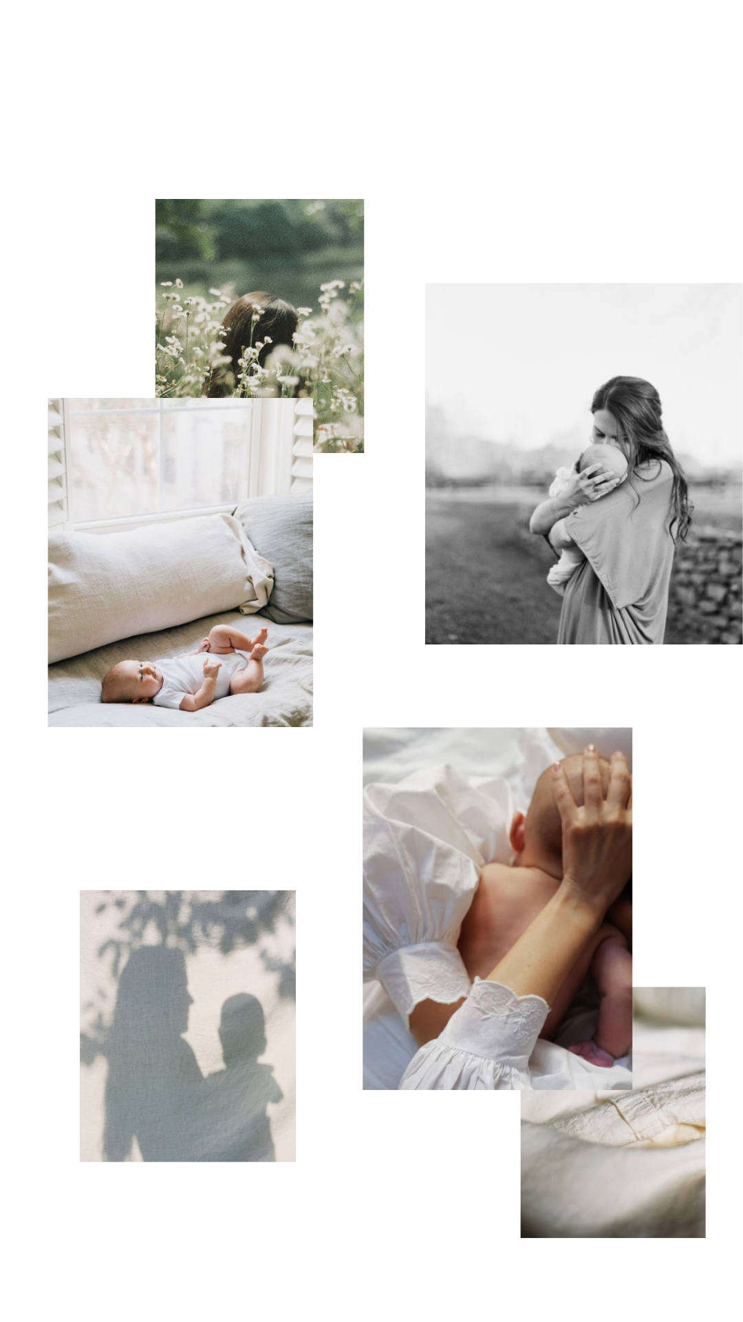
Organic Lifestyle Motherhood Session
Goals: Showcase connection and document the everyday, both inside and outside the client’s home
Key Elements: Natural textures, timeless attire, lush landscapes, soft window light, & simple moments
You are well on your way to sourcing some seriously swoon-worthy inspiration, my friend. Whether you’re a photographer, bride, or mother, consider yourself a purveyor of the finest inspiration, and be warned—this is quite an addicting practice. Cheers to all the Vision Board crafting in your future, and all the beauty that will flow from there!

[…] different. To me, there was an inexplicably captivating quality to how she concocted color stories (learn more about those here!) and fashioned the architecture of her arrangements, bouquets, and installations. I still […]